Instrument Cluster For EVs
UX Re-Design for Automotives

Project Brief
This project aimed to create an interface for the Instrument Cluster of an Electric Bike that aligns with the government regulations while enhancing the riding experience without overwhelming the user.
Customer
The clients are leading manufacturers of Instrument Clusters to be used in a wide range of vehicles. For the upcoming project, they sought a cutting-edge instrument cluster for EVs that would not only display essential information but also offer an enhanced riding experience through seamless integration of technology.
Design Process Followed

1. Requirements & Planning
1.1. Dimensions Benchmarking From Existing Clusters
The dimensions of the elements used in the Instrument cluster across different brands were documented so that the design that we create stands up to the industry standards in terms of legibility. (All mentioned dimensions are in millimeters)

1.2. Symbols To Be Included In The Design
All the symbols apart from the main things like the speed, battery and ODO, were documented. These symbols are governed by the Automotive Research Authority of India and cannot be modified.

1.3. User Persona
All the symbols apart from the main things like the speed, battery and ODO, were documented. These symbols are governed by the Automotive Research Authority of India and cannot be modified.

Stuti Sharma
Software Engineer
Use Case of Electric Bike: Commuting To and From office, Riding to nearby areas for daily chores.
Commute Details
Daily Distance Covered: 15-20 km
Route: Urban roads with moderate traffic
Travel Time: Approx. 1 hour 30 minutes each way
Charging Frequency and Spaces: Charges overnight at home twice a week.
Goals with using an EV
- Reliable Commute
- Efficient Charging
- Cost-efficiency
- Environmental sustainability
- On-road Safety
- Simplicity
Frustration when using an EV
- Range Anxiety
- No vibrational feedback
- Long charging times
Priorities in instrument Cluster
- Speed
- Range and battery
- Indicator
- Alerts and Notifications
1.4. Contextual Enquiry
As a part of the contextual enquiry, the design researcher used an electric bike as the principle vehicle for a week.
Daily Riding Time: 1 Hour
Route type: Open Roads as well as Congested Roads
External Environment: Sunny Daytime, Night Time, Rain, Clear Weather
Charging Frequency: 1-2 times a week of fully charging.
Insights from contextual enquiry:
Most Frequently Checked Items on Instrument Cluster at different times (In order of priority) :

Other insights from contextual enquiry:
- Not all information is presented entirely visually, some alerts require additional sound cues and if possible a haptic feedback.
- Unlike in the case of petrol/diesel vehicle, there are certain information pieces which are more critical in case of EVs, for example the instantaneous power meter is the only cue of how much the rider is accelerating since EVs do not produce vibrations (which can act as a cue) like a petrol bike.
1.5. Constraints and Considerations
As a part of the contextual enquiry, the design researcher used an electric bike as the principle vehicle for a week.
- Segmented LCD: offers limited graphical capabilities and scope of complexity as compared to a TFT LCD. Moreover, the number of segments are limited to keep the product within the desired budget.
- Information Density: For a display size of 90mm x 50mm, we needed to fit a lot of information including Speed, odometer, battery, range and 25+ symbols.
- Legibility: Ensuring all information is easily readable from a distance of 1-2 feet in various lighting conditions, including direct sunlight and low light.
- Government Regulations: Ensuring that the design adheres to all the regulations mandated by Automotive Research Authority of India.
2. Ideation & Paper Sketches
2.1. Design Philosophy – Calm Technology
Calm Technology is a design philosophy that emphasizes technology’s ability to engage users’ attention only when necessary, allowing them to remain focused on their primary tasks.
Key Design Elements Reflecting Calm Technology:
- Clarity and Simplicity: Clearly highlighting the most important elements like speed, indicator, and range through color and size.
- Subtle Feedback Mechanisms: Feedback is provided through non-intrusive methods such as blinking icons and soft audio cues allowing riders to receive important notifications without being startled or distracted.
- Contextual Relevance: Information is presented contextually, ensuring that only relevant data is displayed at any given time. For Example the ODOmeter shows ODO, Trip and Battery Charging Time at the Same place depending on the context.
- Semantic Grouping: Icons are grouped together by virtue of their contextual needs
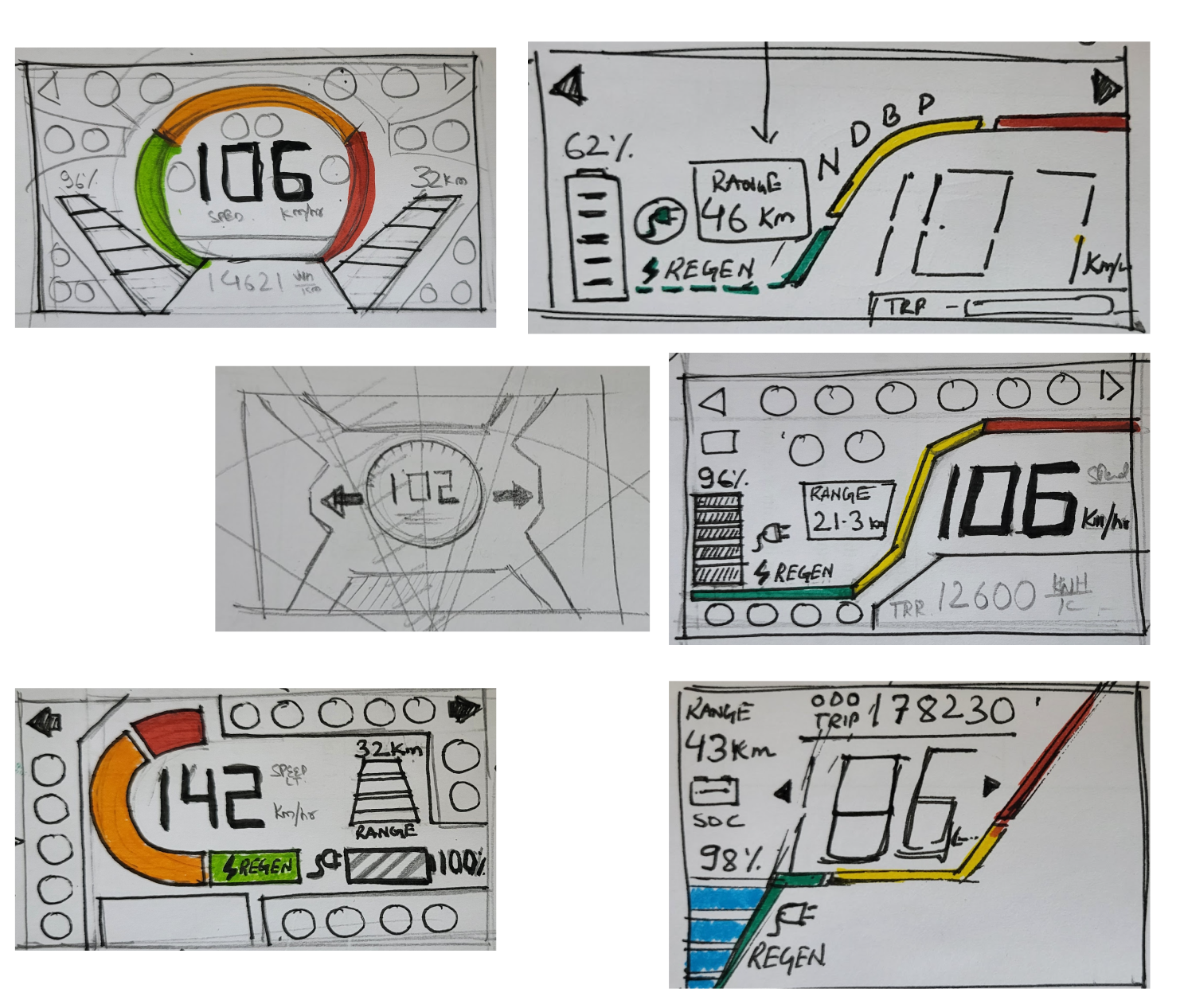
2.2 Paper Sketches
After all the requirements and research gathering, brainstorming was done through sketches to best represent all the information in a clear, simple and understandable manner which best portrays not only all the elements of an instrument cluster but also their interdependencies.
Design principles such as proximity, scale and hierarchy were applied to come up with concepts.
3. Visual Design & UX Specification
The concepts were then converted into proper layouts using final dimensions, fonts and symbols. At this stage we ended up with two final design concepts as shown below.
3.1 Concept – 1
Concept Key Features
- Straightforward Traditional Style Layout
- Most Frequently referred items while driving are encapsulated together and placed at the center.
- Urgent Errors like engine and brake failure are placed together at the top left.
- Similarly, relevant symbols are grouped together.
- Sound Cue is recommended when instantaneous power reaches the red zone.
- Sound Cue recommended when battery falls below 40% and 20%
3.1 Concept – 2
Concept Key Features
- Modern and Futuristic visual approach for layout.
- Text size for speed could be made larger here than the 1st Concept.
- Sound Cue is recommended when instantaneous power reaches the red zone.
- Sound Cue recommended when battery falls below 40% and 20%
- When the Vehicle goes into regen the regen and the strategically adjacent placed battery charging symbol glow as well.
3.3. Design Specifications
Concept – 1 Key Specifications


Concept – 2 Key Specifications


4. Implementation & Quality Control
Design Specifications Handoff:
- Detailed design specifications provided to Front-end development team.
Multiple Rounds of Testing and Feedback:
- Conducted iterative testing sessions post-implementation.
- Solicited feedback from design team and relevant users.
Refinement of Design Specifications:
- Revised design specifications based on feedback and corrections.
Thank You For Scrolling!
Let’s Craft Brilliance Together