Autonomous Data Quality Monitoring
UX Re-Design for the Minimum Viable Product

Project Brief
The project aims to revamp the UI/UX of a data trustability application catering to enterprises with extensive data assets. The proposed solution entails a comprehensive redesign to modernize the UI, standardize taxonomy, streamline navigation, enhance data visualization, and introduce a personified AI Assistant for validation tasks.
Customer
A Silicon Valley startup having state of the art technology for creating Autonomous Data Quality Validation for all the data in any enterprise. They had a proof of concept level product UI ready, we created a much learnable, contemporary and easy to use experience for the enterprise users.
Design Process Followed

1. Requirements & Planning
1.1. User Personas Creation

CMO
Business User
“I want a simplified user experience with clear task flows so that I can easily validate the quality of my data without needing deep technical knowledge. I anticipate intuitive visualizations that’ll transform complex data into actionable insights effortlessly.”
Pain Points

Data Architect
Technical User
“I want a streamlined and user-friendly process for managing data connections and validation checks, so that I can easily onboard datasets into different projects and ensure data quality without manual effort.”
Pain Points

Data Analyst
Technical User
“I want an intuitive and comprehensive user interface with task-oriented workflows, so that I can efficiently navigate and validate data, manage custom rules for data tables, and easily communicate insights at different levels of administration.”
Pain Points
1.2. Heuristic Evaluation of Existing UI
Three seasoned design experts conducted a heuristic evaluation focusing on distinct aspects of usability. Their collective evaluation aimed to refine the design aspects, prioritizing user-centric improvements like usability, learnability, findability, standardization, etc.


1. The filter icon which is essentially a column level search opens up a pop-up for search and adds an extra unnecessary step.
2. The export table options belong at the table level menu and should be harmony with the visual style of the table.
3. The green fill around connection name makes it looks like a button. It just indicates the health status of the connection.
4. The vertical lines are not needed and they increase the visual noise in the table.
5. The action icons are all in different colors and are visible all the time for all the rows which makes the table look cluttered.
6. The more options show the hidden column values, which is not a very good way to show them.
7. “Show” does not very clearly indicate that the filter is being “applied”
During the heuristic evaluation, recurring usability issues were identified:
2. Ideation & Paper Sketches
2.1. User Flows
Three seasoned design experts conducted a heuristic evaluation focusing on distinct aspects of usability. Their collective evaluation aimed to refine the design aspects, prioritizing user-centric improvements like usability, learnability, findability, standardization, etc.

2.2 Paper Sketches
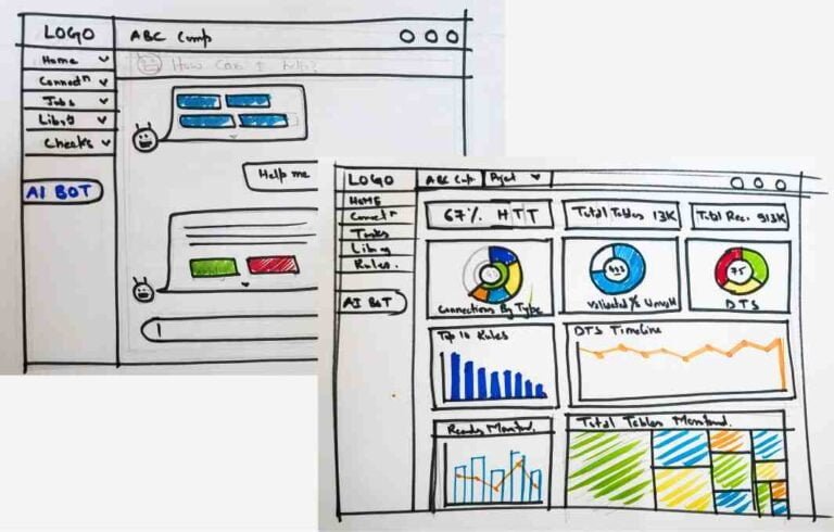
Concepts were iteratively developed through multiple rounds of paper sketches before jumping to the digital medium and preparing the wireframes.
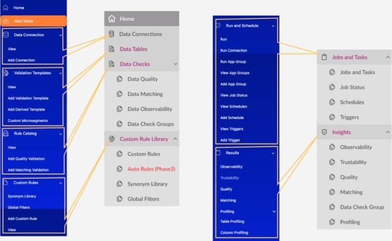
2.3. Revamping the Taxonomy & Information Architecture
The app’s structure and navigation were redesigned, improving how users find features. This revamp focused on reducing clutter by refining options and optimizing taxonomy, leading to a more intuitive and efficient navigation system.
3. Wireframing, Refine & Iterate
3.1. Low-Fidelity Wireframes and Interaction Patterns
Interactive design patterns like table interactions, data filtering, status indicators, etc, were introduced for enhancing the usability.
4. Visual Design & UX Specification
4.1 Final Hi Fidelity Screens design for the MVP
The Low-fidelity wireframes were refined with the added visual design in accordance with the brand identity of the product. Furthermore, interactions were designed and highlighted using zero-code clickable prototypes.
4.2. AI Assistance
Conceptualization
The AI assistant was personified as a “Buck” character which also serves as the brand mascot. This adds to the visibility, interactivity and engagement of the feature.

Interaction Guidelines
After research and iterations, following interaction guidelines were defined to increase the perceived credibility and engagement of the AI assistant:
- Ensure trust through upfront disclosure of capabilities and limitations of the chatbot.
- Implement dynamic delayed responses for a realistic interaction.
- Show task completion progress and allow users to terminate tasks at any stage.
- Enable users to make amendments within the chat interface.
- Provide optional visibility into the logic behind the provided information.
- Cite sources of information from within the application, e.g., table or project names.
AI Autonomy
- Buck provides autonomous recommendations to enhance user efficiency.
- Autonomously suggests actions based on user behaviors and preferences.
- Makes independent decisions to streamline user experiences.


4.3. Design System
We designed a complete Design system, comprising of all common UX patterns, to make the application consistent and make a matured Enterprise Application. Some examples of component specifications and visual style guide from the design system.


5. Implementation & Quality Control
Design Specifications Handoff:
- Detailed design specifications provided to Front-end development team.
Recommendations for Specification Corrections:
- Noted errors in specifications and suggested necessary corrections.
Identification of Bugs and Loopholes:
- Identified and reported bugs and functional loopholes in the implemented product.
Multiple Rounds of Testing and Feedback:
- Conducted iterative testing sessions post-implementation.
- Solicited feedback from design team and relevant users.
- Implemented optimizations to make the product more lightweight and efficient.
Refinement of Design Specifications:
- Revised design specifications based on feedback and corrections.
Thank You For Scrolling!
Let’s Craft Brilliance Together