Personal Guide to the Stars
Redesign the existing mobile app

Project Brief
The client had an existing android app which was not much usable, with confusing navigation structure and workflows. The mobile application that provides astrology services and personalised horoscope readings to clients.
The newly designed app offers a user-friendly interface, accurate predictions, and insightful astrology content to cater to the diverse needs of users interested in astrology and horoscopes.
Customer
A well known Experienced Astrology Guru wanted the astro app redesigned to make it user friendly, that will appeal to tech savvy users.
The primary target audience includes individuals interested in astrology, horoscopes, and spiritual guidance, predominantly located abroad. This audience may vary in age, gender, and cultural background but shares a common interest in exploring astrology for personal insights and guidance.
Design Process Followed

1. Requirements & Planning
1.1. Understand Concept of the Product
The concept of an astrology app involves grasping its purpose, features, and potential benefits for users interested in astrology and related practices. We tried to breakdown the concept.
Purpose:
An astrology app serves as a digital platform designed to provide users with access to astrological insights, horoscope readings, personalized predictions, and spiritual guidance. The app caters to individuals who seek to explore astrology for various reasons, including self-discovery, relationship insights, career guidance, and spiritual growth.
Key Features:
Personalized Horoscope Readings, Astrological Compatibility Analysis, Live Consultations with Astrologers, Astrology Articles and Content, Astrological Tools and Calculators, Daily Horoscope Notifications & User Profiles and Preferences.
Purpose:
An astrology app serves as a digital hub for users to explore astrology, receive personalized insights, and connect with a community of like-minded individuals.
1.2. Define User Personas
We tried to understand personas’ motivations, challenges, and expectations will enable online astrologers to create meaningful and transformative experiences that resonate with their spiritual journey and quest for self-discovery in the digital realm.

Pandit Ram Ji
Astrology Consultant
“Beginning a profession as an IIT student, today Pt. Ram Sharan ji is a well-recognized Vedic astrologer and Kundali Expert not only in India but in various different parts of the world. Being the best astrologer in Delhi, he is very popular for giving accurate predictions concerning political issues. According to him, astrology is a science, dealing with the position of various planets.”
Pain Points

Neha Shah
Seeker
“I am a 28-year-old marketing executive. I have recently developed an interest in astrology. I am an open-minded and curious about spirituality, seeking deeper insights into herself and her life’s purpose.”
Pain Points

Ramesh Kumar
Seeker
“I am a 46-year-old Bank Manager with a keen interest in astrology and spirituality. I am working remotely and pursuing creative projects in my spare time. I value self-reflection, mindfulness, and holistic wellness practices.”
Pain Points
1.3. Heuristic Evaluation of Existing App UI
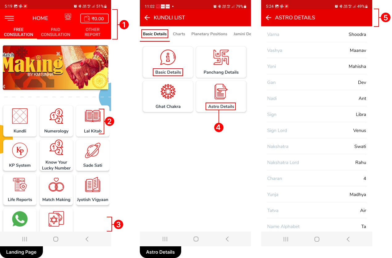
After conducting a thorough heuristic evaluation, it became evident that the app lacked professional design standards. Specifically, it did not adhere to UI guidelines, UI color theory principles, or implement user-friendly workflows, resulting in a subpar user experience.

1) The top section of the interface suffered from clutter, primarily due to the similarity in color between the navbar and tabs. As a result, users found it challenging to differentiate between the two elements. Additionally, the abundance of clickable elements compounded the issue, further complicating navigation. The lack of sufficient click area for each element exacerbated the problem, making it frustrating for users to interact with the interface.
2) Noticed the visual clutter primarily due to the size and color of icons within the cards. Additionally, an abundance of cards occupied significant screen real estate, further contributing to the cluttered appearance.
3) The absence of bottom navigation hindered UI navigation, creating usability challenges for users. Without this navigation element, users found it cumbersome to move between different sections or features within the interface.
4) Users encountered redundant access to the same content and found that the organization of content lacked hierarchy, leading to confusion.
5) A lack of links in the top navigation bar, which would have facilitated easy access to essential features. Additionally, the absence of the user’s name made it challenging to identify who the displayed details belonged to.
Overall this workflow appeared to lack a focus on usability, causing inefficiencies and user frustration.
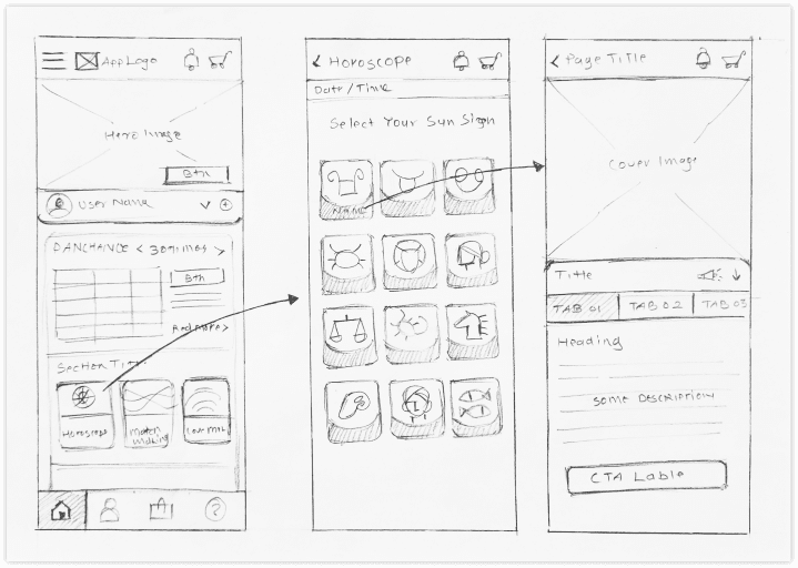
2. Ideation & Paper Sketches
2.1 Paper Sketches & Whiteboarding
Concepts were iteratively developed through multiple rounds of paper sketches before jumping to the digital medium and preparing the wireframes.


3. Wireframing, Refine & Iterate
3.1.Wireframes
Our Designers created several wireframes to freeze user flows, UI, interactions and it was helpful to avoid more & more Hi-fidelity iterations and a clear focus on functionality. The wireframes allowed us to visualise exactly what kind of UI elements will work in different scenarios and making sure there is consistency in the patterns.
3.2. Zero-Code Clickable Prototype
Our UX Designers created a Finished looking Zero-Code clickable Prototype.
The Clickable demo proved to be really useful for customer approvals as well as Developer communications.
4. Visual Design & UX Specification
4.1 Final Hi Fidelity Screens design for the MVP
After the Clickable prototype demonstrated and discussed with prospective customers, we finalised a set of features for the MVP.
Finalising the Visual Design: Our Visual Designers created branding for the product, (which later became branding for the company as well) The Visual Designers created 4 modern visual design options complimenting the brand design guidelines.
Detailed UX Specifications: The Detailed design for all the screens was created for every flow in the product. Starting from the login screens, Landing page, User’s horoscope & prediction, Online Courses & shopping etc.
4.2. Design System
Since the product had several stakeholders and interdependent workflows, Consistency was utmost important to increase the learnability of the system. OUr Design system expert created a very detailed ‘Design System’ with all the Commonly used UI patterns like Tables, filters, buttons, stepper, form fields, and Notification systems.
The UI developers could pick from the final design system and build / customise certain UI elements to be used in the application.
Some examples of component specifications and visual style guide from the design system.

5. Implementation & Quality Control
Design Specifications Handoff:
- Detailed design specifications provided to Front-end development team.
- Designed reusable & responsive UI components that helped developers a lot while implementing.
Recommendations for Specification Corrections:
- Co-ordinated with front-end developers to adjust HTML & CSS as per UI specs.
Identification of Bugs and Loopholes:
- Observed many UI & functionality related issues and raised those issues in JIRA and assigned to respective person to fix.
Multiple Rounds of Testing and Feedback:
- Conducted iterative testing sessions post-implementation.
- Solicited feedback from design team and relevant users.
- Implemented optimizations to make the product more lightweight and efficient.
Refinement of Design Specifications:
- Revised design specifications based on feedback and corrections.
Thank You For Scrolling!
Let’s Craft Brilliance Together

