Redesign of Portal for a Market Research Company
UX Re-Design for the information portal
About the Client
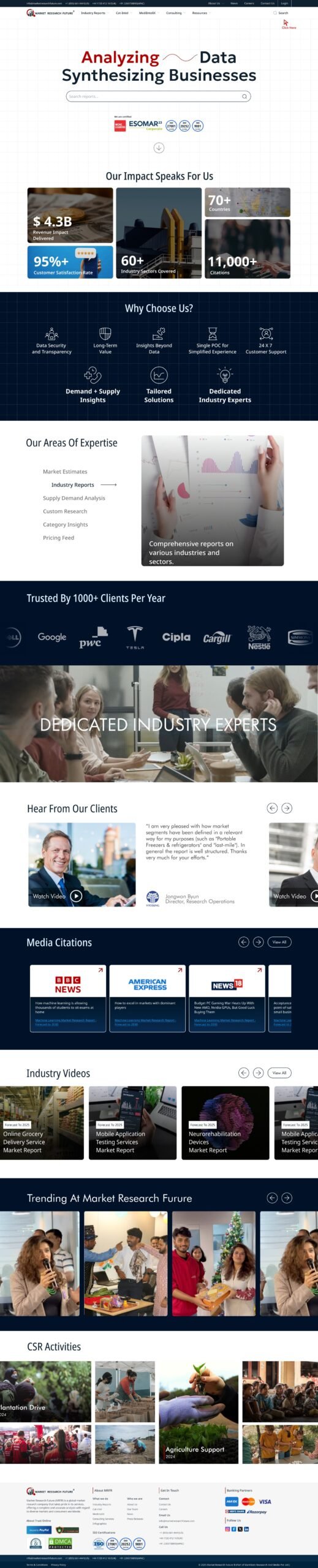
Client is a global market research company that delivers market analysis reports across 13+ industry sectors. The product in question is a web platform for making the market reports quickly accessible to the users and facilitating the purchase decision.
Need for Redesign
- To make the platform scalable for incorporating the new range of reports being introduced.
- Showcase better credibility and trustworthiness to attract more users through the website.
- Reduce drop-outs happening due to poor comprehension of report summaries.
- Make the platform more mobile-friendly.
- User friendly and usable, and aesthetically pleasing.
Design Process Followed
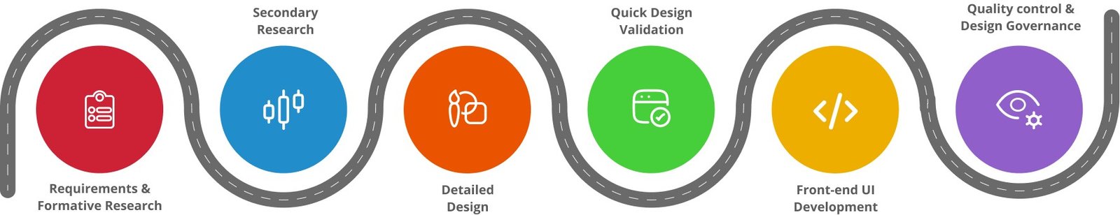
1. User Understanding (Primary research)
Based on extensive discussion sessions with the marketing team, existing users and Insights from Site Analytics.
Workshop with stakeholders to understand requirements.
1.1. Users
C-level executives, VPs, investors, and marketing/sales professionals seeking reliable market insights to guide decision-making.
1.2. Why Users Need Market Research Reports
- Identify opportunities for market entry.
- Scope potential for new offerings within existing businesses.
- Explore markets for investment prospects.
- Conduct competitive analysis for pricing, business, and market strategies.
- Plan future operations based on current trends and emerging opportunities.
1.3. Key User Behaviors
- 95% of users engage with reports from a single industry sector relevant to their work.
- Purchase decisions are primarily influenced by four report elements: market size, key players, opportunities, and trends.
- The typical purchase flow: show interest → request a sample → discuss customizations with the research team → complete purchase (offline).
- Only ~4% of users purchase reports directly through the platform.
2. UX Audit /Competitive Analysis (Secondary Research)
2.1. UX Audit
Usability Issues Found
- Inconsistent global navigation.
- Unclear terminology/labels.
- Missing breadcrumbs and back-navigation.
- Non-persistent filters & lacking advanced options.
- Unclear CTAs.
- No proper feedback on actions.
- Non-intuitive card interactions.
- Poorly organized Information within pages.
UI Issues Found
- Inconsistent visual elements.
- Overcrowded layouts.
- Low text contrast ratios.
- Missing hover states or interactive cues.
- Information grouping in non-semantic in a lot of pages.
- Non-sticky filters that scroll away.
- Incohesive visual language.
- Poor spacing causing excessive scrolling.
2.2. Competitive landscape
A comprehensive competitive analysis was conducted across leading market research platforms, including Gartner, Statista, and Frost & Sullivan, to identify standard industry usage patterns and established UX conventions. This evaluation revealed how top platforms structure navigation, surface key insights, and communicate credibility
2.3. Improvement Opportunities
- Standardize Navigation & Information Architecture
- Improve Interaction Feedback
- Enhance Visual Consistency & Accessibility
- Refine Terminology & User Guidance
- Optimize Workflows & Components
3. Detailed Design of pages, and interactions
3.1. Low-Fidelity Wireframes and Interaction Patterns
1. Visual Style definition
2. UX Design system : UI Library created
3. Restructuring the Information Architecture
4. Navigation and UI elements Restructuring
- Two-tier primary navigation to distinguish between transactional* v/s non-transaction pages.
- Simplified and Scalable user flow for accessing reports.
- Improved taxonomy for better understanding.
- Mega-menu and global search help find relevant info faster.
- Contact info and action brought upfront for lead generation.
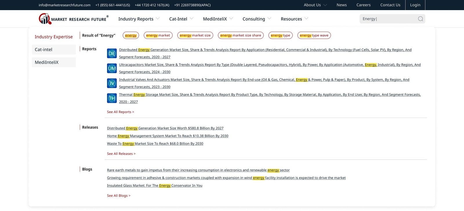
5. Search and Search results Experience Design
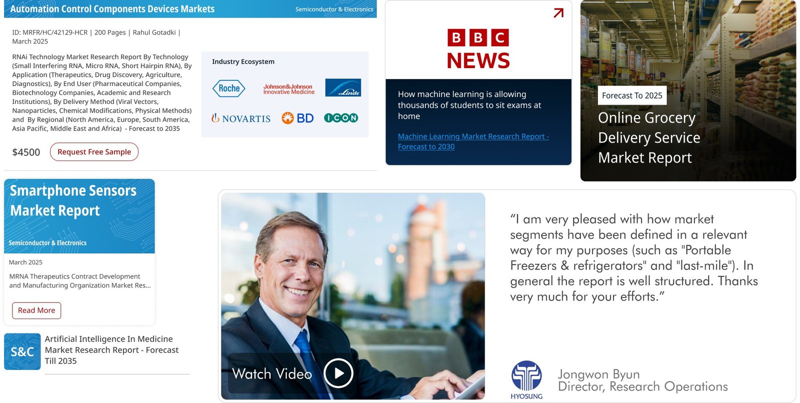
6. Designing Consistent Variations of all design elements like Report Widget (Show all variations of report card)
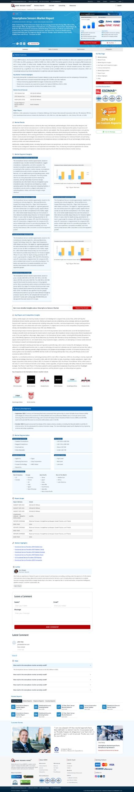
7. Report List Page
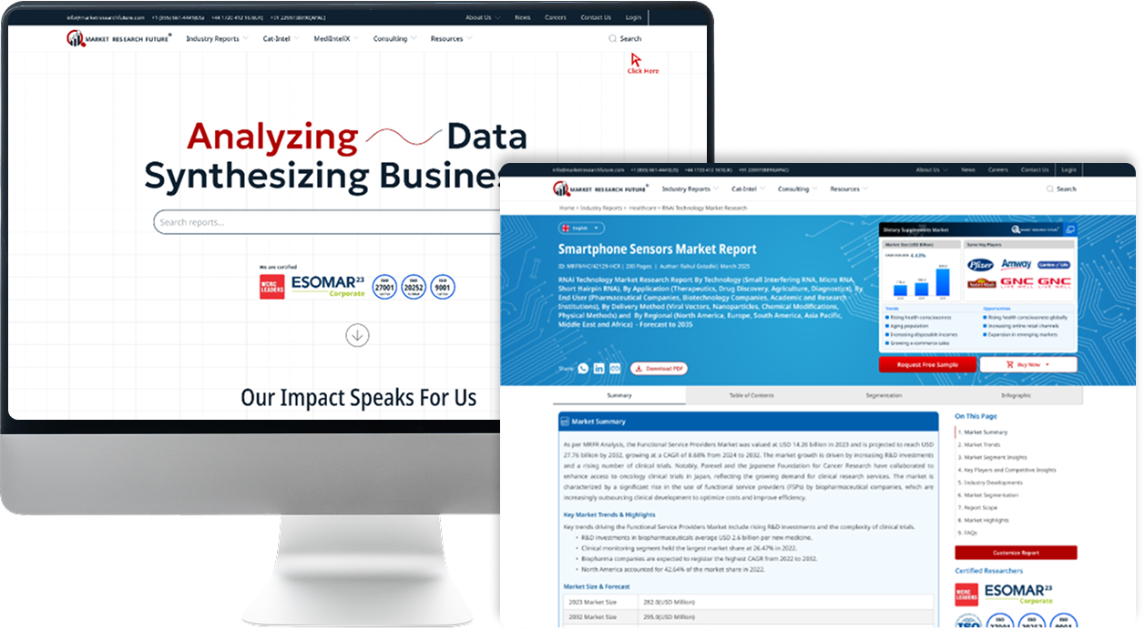
8. Report Summary Page – Reducing Decision Time
9. Home and About Page – Driving User Trust through storytelling
10. Other 50+ Supplementary Pages
4. Quick Design Validation
A quick prototype testing round was conducted to validate core design decisions early and ensure the redesigned experience aligned with user expectations. This helped identify friction points, refine clarity, and strengthen the overall usability of key flows.
Key Steps in the Process:
- Created interactive prototypes representing the redesigned navigation, report summary structure, and CTAs.
- Conducted lightweight testing sessions with users from target segments (executives, analysts, investors).
- Observed real-time interactions to assess comprehension, navigation flow, and decision-making cues.
- Gathered qualitative feedback on clarity, relevance, and overall ease of use.
- Iterated rapidly on layout hierarchy, labels, and microcopy based on user insights.
- Finalized validated design improvements before moving into development.
5. Front-end (UI) Development
The client preferred not to use any front-end frameworks due to previous experiences. They requested us to deliver the design using only HTML5, CSS3, and JavaScript. It was a significant challenge to make the website fully responsive and adaptive, given the complexity of both its design and functionality. The project included a total of 55 pages, and our designers and developers invested significant effort to hand-code each one meticulously. We ensured the markup was SEO-friendly by using semantic HTML tags, making the content easily searchable and accessible.
The project stands as a testament to our team’s precision, adaptability, and commitment to quality — transforming a complex design into a high-performing, responsive, and SEO-friendly experience.
6. Quality Control and Design governance
The client preferred not to use any front-end frameworks due to previous experiences. They requested us to deliver the design using only HTML5, CSS3, and JavaScript. It was a significant challenge to make the website fully responsive and adaptive, given the complexity of both its design and functionality. The project included a total of 55 pages, and our designers and developers invested significant effort to hand-code each one meticulously. We ensured the markup was SEO-friendly by using semantic HTML tags, making the content easily searchable and accessible.
The project stands as a testament to our team’s precision, adaptability, and commitment to quality — transforming a complex design into a high-performing, responsive, and SEO-friendly experience.
6.1. Design System
Top Navigation Bar

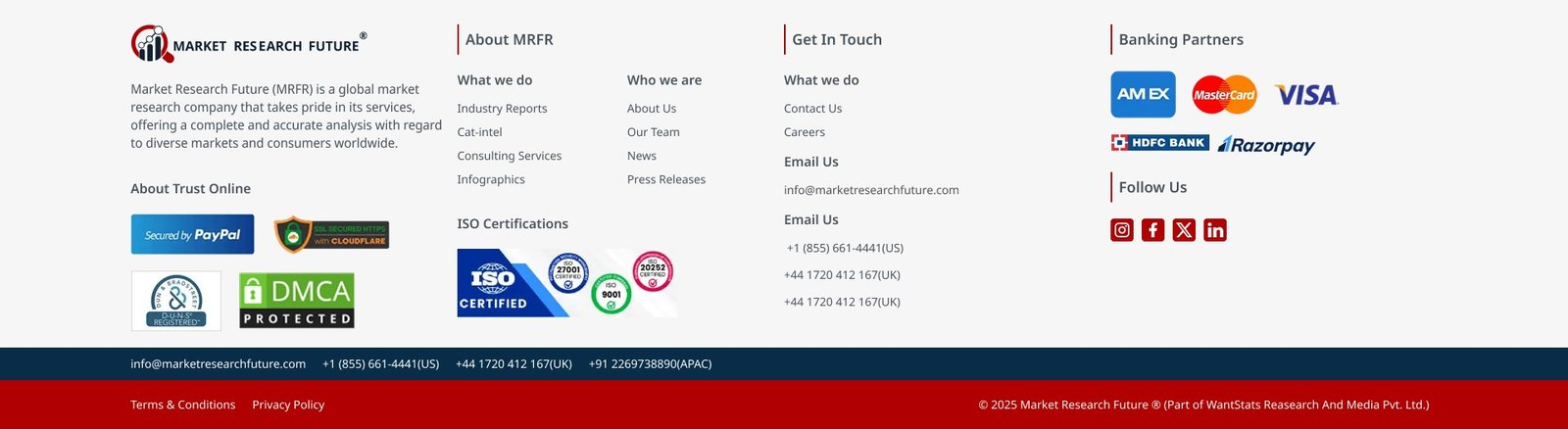
Footer
Search Result (Dropdown)
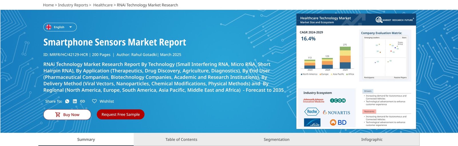
Hero section and navigation of “Report Details” page
Collapsed on scroll

Cards