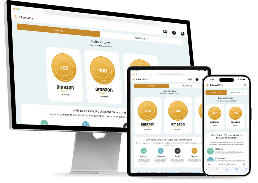
The client sought to revamp the UX design of their product. Upon review, we identified several issues, including information architecture, onboarding flow, feature hierarchy, token action flows, and responsive UI design. We resolved these issues, reducing cognitive load, improving workflows, and creating easier and more intuitive UI interactions.
A group of people from four different locations discovered a smarter way to gift with their Digital Gifting Solution App. Effortlessly redeem, exchange, re-gift, and donate digital tokens, reducing the impact of unwanted gifts while spreading joy and promoting sustainability. Perfect for all your gifting needs.

A digital gifting app provides a modern solution for sending and receiving gifts. It allows users to send digital tokens instead of physical items, which can be redeemed, exchanged, re-gifted, or donated, making gifting convenient, flexible, and sustainable.
The purpose of the digital gifting app is to simplify the gifting process, making it more efficient and eco-friendly. It aims to provide a seamless experience for both givers and recipients by offering versatile options for gift redemption and management, reducing the environmental impact of traditional gifting.
Digital Tokens: Send and receive digital tokens that can be used for a variety of gifts. Redeem: Recipients can redeem tokens for gift card of any brand. Exchange: Tokens can be easily exchanged for different brands or items if the initial choice doesn’t suit the recipient. Re-Gifting: Simplified process for re-gifting tokens to friends or family members. Donation: Option to donate the value of the token to a charity of choice. Sustainability: Reduces the environmental impact by eliminating the need for physical packaging and shipping. Instant Delivery: Digital tokens are delivered instantly, ensuring timely gifting. User-Friendly Interface: Intuitive app design for easy navigation and use. Customizable Messages: Personalize your digital gifts with custom messages and photo or video to add a personal touch.
The digital gifting app revolutionizes the traditional gifting process by introducing a versatile, convenient, and eco-friendly alternative. The app not only simplifies gifting but also aligns with modern values of efficiency and environmental responsibility, making it the perfect solution for today’s digital age.
Understanding the diverse needs of TokenGift’s users, from corporate HR managers streamlining employee rewards to students looking for convenient ways to gift friends. Each persona helps to tailor TokenGift’s features, ensuring a personalized, user-friendly experience that addresses unique gifting challenges and goals.

CEO
“I am the CEO and founder of a growing tech company with around 200 employees. I value my team highly and believe in recognizing their hard work and dedication. I often seek ways to boost employee morale and show appreciation through thoughtful gifts. However, managing this process efficiently and effectively poses several challenges for me.”

Marketing Manager
“I am a busy marketing manager at a tech company. I have a demanding job that requires a lot of my time and energy. I enjoy staying connected with friends and family through social media and love giving and receiving gifts. However, my hectic lifestyle often leave me with little time to shop for gifts, and I struggle to find thoughtful presents that are both meaningful and convenient.”

College Student
“I am a college student juggling my academic responsibilities with a busy social life. I love giving gifts to my friends for birthdays, holidays, and special occasions but often face challenges due to my limited budget and hectic schedule.”
After conducting a thorough heuristic evaluation, it became evident that the app lacked professional design standards. Specifically, it did not adhere to UI guidelines, UI color theory principles, or implement user-friendly workflows, resulting in a subpar user experience.

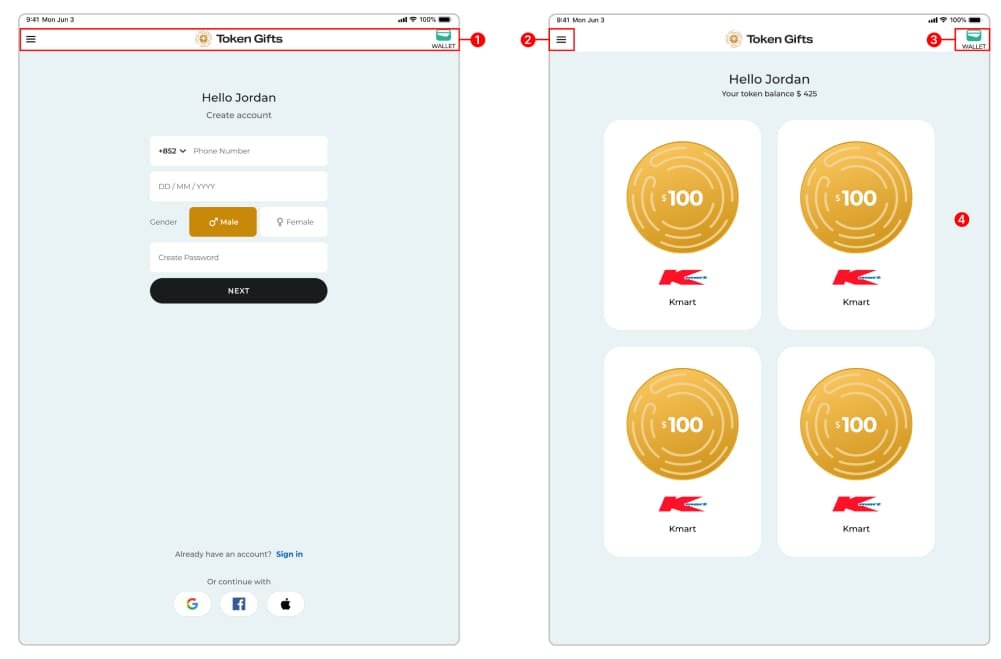
1) The app displays navigation options before the user has signed in or signed up, which can lead to confusion. Users might assume they can access certain features or navigate the app without logging in, only to be interrupted by prompts to sign in or register. This lack of clarity disrupts the onboarding experience, as it can make the app’s entry process feel inconsistent and unintuitive.
2) The app included a hamburger menu icon to access the left-side menu, but the menu’s structure lacked organization, with no clear separation between primary (1st level) and secondary (2nd level) navigation options. This unstructured layout made it difficult for users to find what they needed, as essential features and sub-features were intermixed without a logical hierarchy. This poor organization in the menu design disrupted the user experience, making navigation inefficient and confusing.
3) The wallet section of the app included two main categories: Token and Gift Card. However, there was no dedicated navigation or clear tabs to switch between these categories, leaving users unable to access or manage each section easily. This lack of navigation options created confusion, as users were left unsure how to locate or organize their tokens and gift cards separately within the wallet, ultimately impacting their ability to interact effectively with these features.
4) The Dashboard or landing page was inadequately designed, lacking a clear structure for displaying essential information. Key data or summary insights were either missing or not effectively highlighted, leaving users without a quick overview of their information. Additionally, there was no accessible help or guidance for performing the four primary actions within the app, which are crucial for smooth navigation and task completion. This lack of organization and guidance on the Dashboard reduced usability, making it challenging for users to orient themselves and engage effectively with the app’s main features.
Concepts were iteratively developed through multiple rounds of paper sketches before jumping to the digital medium and preparing the wireframes.

Our Designers created several wireframes to freeze user flows, UI, interactions and it was helpful to avoid more & more Hi-fidelity iterations and a clear focus on functionality. The wireframes allowed us to visualise exactly what kind of UI elements will work in different scenarios and making sure there is consistency in the pattrns.


Our UX Designers created a Finished looking Zero-Code clickable Prototype.
The Clickable demo proved to be really useful for customer approvals as well as Developer communications.
After the Clickable prototype demonstrated and discussed with prospective customers, we finalised a set of features for the MVP.
Finalising the Visual Design: Our Visual Designers created branding for the product, (which later became branding for the company as well) The Visual Designers created 4 modern visual design options complimenting the brand design guidelines.
Detailed UX Specifications: The Detailed design for all the screens was created for every flow in the product. Starting from the login screens, Landing page, User’s horoscope & prediction, Online Courses & shopping etc.


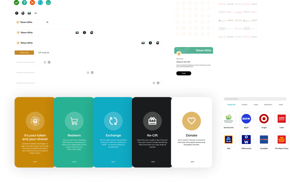
Since the product had several stakeholders and interdependent workflows, Consistency was utmost important to increase the learnability of the system. OUr Design system expert created a very detailed ‘Design System’ with all the Commonly used UI patterns like Tables, filters, buttons, stepper, form fields, and Notification systems.
The UI developers could pick from the final design system and build / customise certain UI elements to be used in the application.
Some examples of component specifications and visual style guide from the design system.

Design Specifications Handoff:
Recommendations for Specification Corrections:
Identification of Bugs and Loopholes:
Multiple Rounds of Testing and Feedback:
Refinement of Design Specifications:
1st Floor, Business Square, Baner – Pashan Link Rd, Pashan, Pune, Maharashtra 411021
Ringslang 124. 1187-BT, Amstelveen, The Netherlands
© 2024 All Rights Reserved.